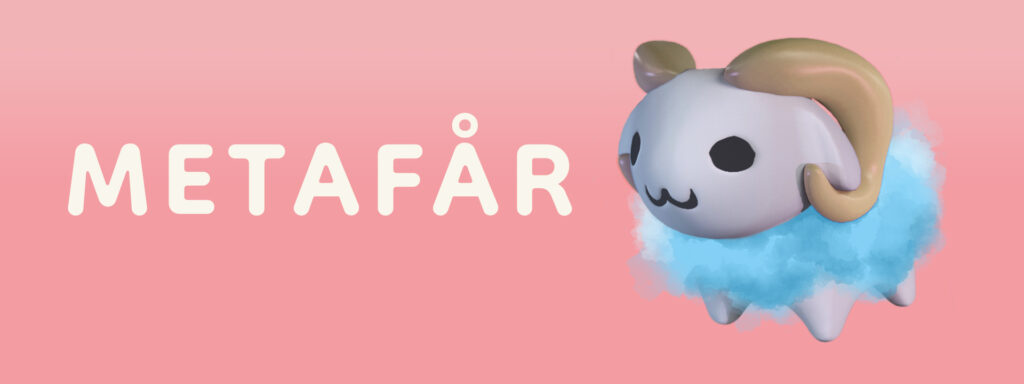
MetaFår Remote Toy
Ideation
The design team initiated the process with a number of brainstorming sessions centering around three themes:
- Remote communication
- Feelings and empathy
- Artifacts
1.
The first theme explored how one could communicate not using words and over a distance. The session yielded broad concepts such as light and sound, concrete concepts like skywriting, and sensory ideas such as heat and cold or soft and hard touches.
The second theme, feelings and empathy, discussed general concept like mood, tonality and duration, physical expressions such as smiles and hugs, and item-based concepts like food or gifts.
Lastly, potential artifacts where explored. The team discussed a plant that grew with the relationship; storytelling and message-based communication through light; and and playcentric solutions akin to Etch-A-Sketches.
Considering the target groups abilities (one’s lack of literacy and another’s lack of digital literacy) the team decided to focus on play as a form of communication. It was deemed a fundamental way of communicating with a low thresholds regardless of one’s capabilities. Thus, the problem defined was: how can two groups of people play remotely, with physical objects, in a non-time dependent manner?
Sketching & ITK
The development work continued with a sketching and an ITK (Identity Tool Kit) analysis.
Sketching
Through the sketching process and discussions the team approached a type of modular toy, starring a sheep, and an app which would encourage play and engagement.
ITK
The ITK included a State Board, a Future Board, and a Shape & Color Board.
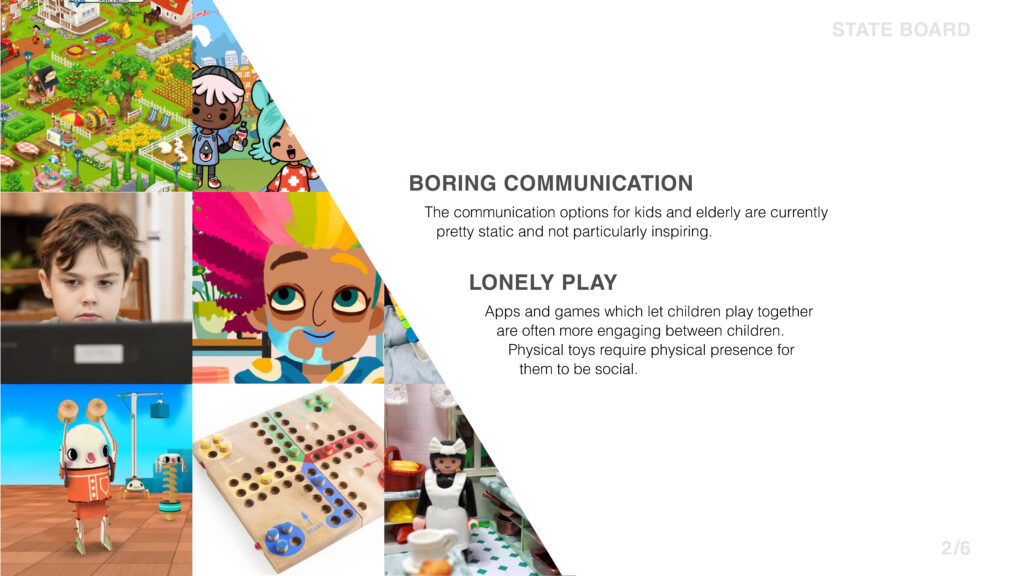
The State Board defined the current state. Toys were of a messy make-up of materials and colors, which either appealed to the parents or the children, and many toys feature small parts which can be easily lost. It also defined that playing or communicating (especially across vastly different age groups) either required physical proximity or being stationary in front of a screen.
The Future Board section of the ITK then set out to respond to these challenges in the context of the teams concept.
- The toy needed to encourage play and collaboration detached from physical space and immediacy
- It needed to function both as play and decoration to facilitate easy storage
- The interactivity needed to encourage play rather than task-solving, ease of use was thus an important aspect to encourage the spontaneity of feelings and empathy
- The toy ought to be modular to allow for different, adaptable types of play and to allow it to grow over time with the interest of the players.
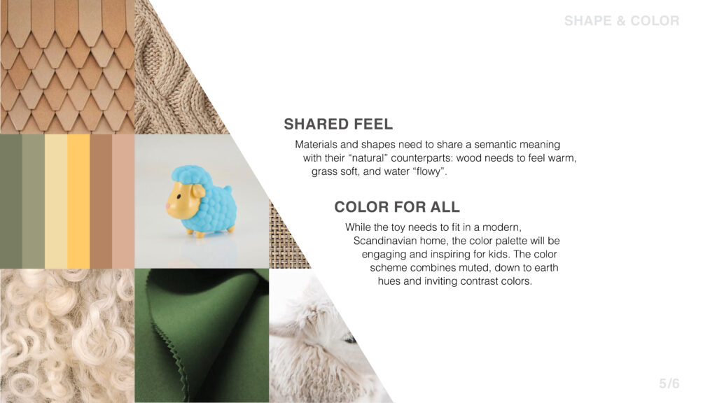
The Shape & Color Board treated how to implement certain affordances.
- Materials needed to have a metaphorical, not direct, affordance to their natural counterparts. For example, grass elements in the toy needed to feel “soft” and water elements “liquid”. This would be achieved by using unexpected materials, such as neoprene.
- Colors needed to be adequately saturated to engage the children, but it was decided to mix these colors with more discrete hues so that the toy would fit in a more minimalistic or toned down home.
- Shapes were to be soft and hard edges avoided both for safety reasons but also to afford the sense of warmth and softness associated with empathy and feelings.
- Lastly, these soft, metaphorical aspects needed to be cohesive across the toy and the app to connect the two not just in functionality but also in its look and feel.
Result
Practically this concept resulted in a series of mockups for the app as well as sketches and a 3D rendering of the toy.
Toy
The toy itself had two components: a sheep and the modular “fields” where the sheep lives. The sheep had soft, round shapes to be approachable and safe. The “fields” are a number of modular pieces which allowed for a variety of play. This could for example be a stable field for sleeping, a trough field for eating and drinking, or a pond field for bathing. The field base was designed as a hexagon partly to allow for flexibility in its connections but also to create a more organic shape when it was put together.
App
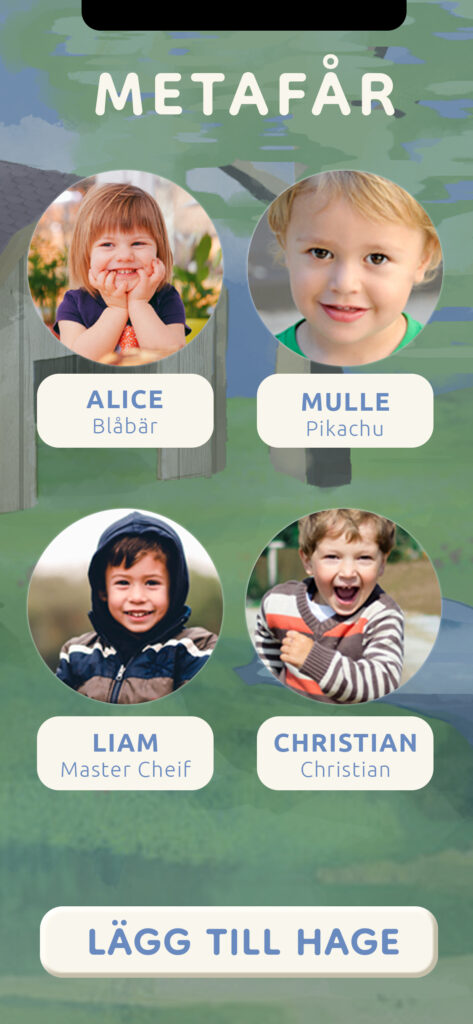
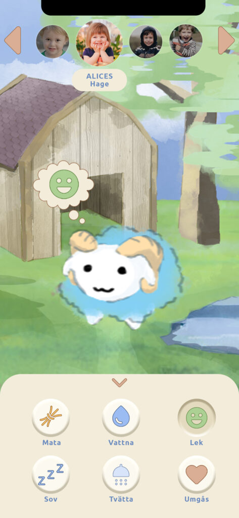
The app then allowed the user to connect with a number of pens, say one for each grandchild, and would register what types of fields each pen included. The user could then move around a 3D representation of the toy and for example tap the stable to encourage sleep, a pond to encourage bathing or a trough to encourage eating. The idea is that this could partly be a type of play, to play together remotely and independent of time, but also a type of communication remotely: “I am now going to eat” or “Have you eaten yet?”
Earlier iterations of the app included sections to keep track of when one last performed an activity or the progress of an activity. This idea was scrapped to facilitate the more spontaneous approach to play, communication, feelings, and empathy. The end result simply focused on actions and immediacy. Simply: let’s play together.
Course Assignment
The name “MetaFår” is wordplay on the words “Metaphor” and “Får”, the Swedish word for “sheep”.
In this assignment the team was instructed to produce 1) a digital solution and 2) a physical artifact.
In this assignment the team was instructed to produce 1) a digital solution and 2) a physical artifact.
The two needed to be connected, and the physical artifact were not to have a screen.
The aim for the pairing was to connect people through remote communication. The two target groups involved were:
- Elderly with limited digital/technical literacy
- Children who couldn’t yet read
Software


Details
Areas of Responsibility
Ideation, sketching, project management, toy/artifact design, app design (UX and UI).
Team Size
4
All areas introduced on this page were either the main responsobility of the author (such as the app) or a shared responsibility (such as the concept design). 3D modelling and rendering curtsey of Marcus Jonsson. Header concept based on 3D rendering created by author.
